sentry
academic work · design system · 2023
problem
an avalanche transceiver is the only piece of gear you buy hoping never to use it – and the only one you will operate with a heart rate of 180, gloves on, wind in your face and fifteen minutes before odds collapse. yet the category still communicates like consumer electronics: crowded housings, menu logic, feature lists.
idea
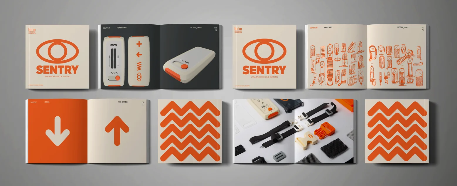
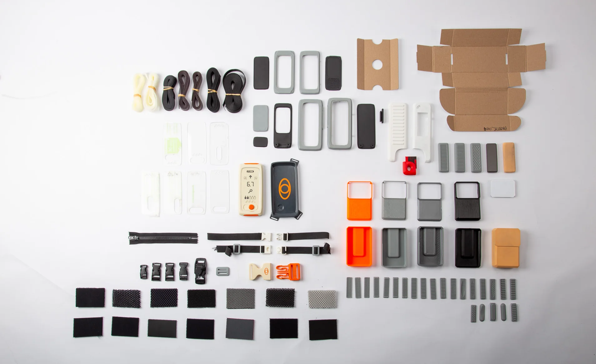
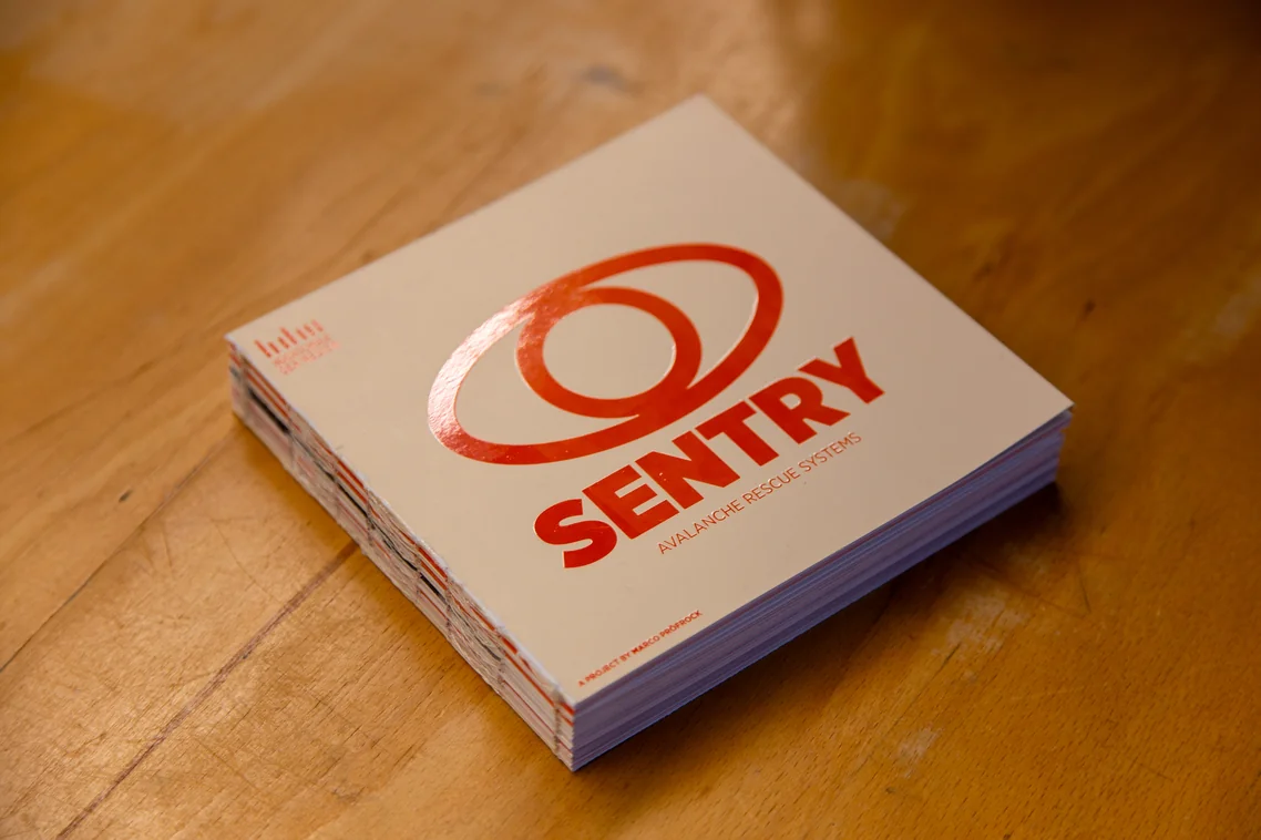
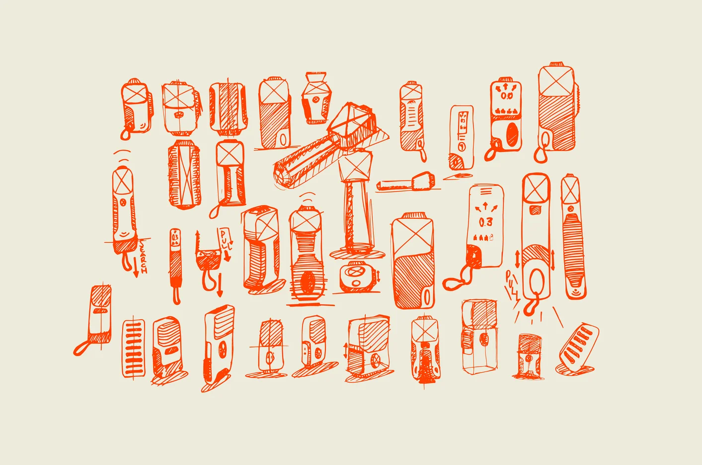
build the brand around one promise – your sentry in the mountains – and judge every decision by a single question: does it survive panic? identity, housing and interface become one system, so intuition is treated as a safety feature rather than a nice-to-have.
solution
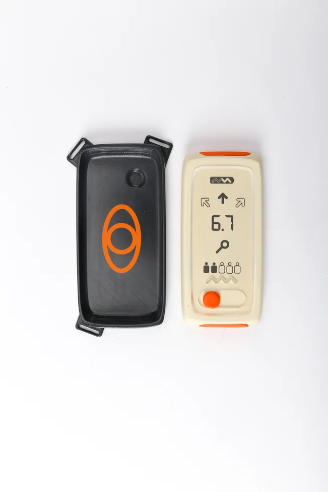
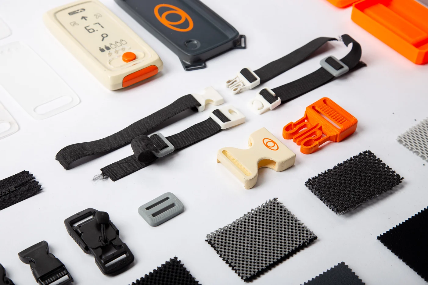
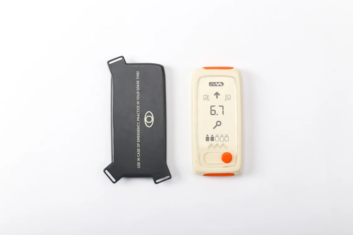
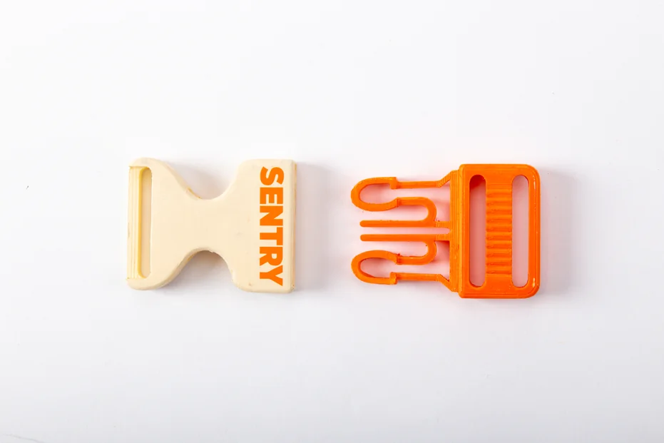
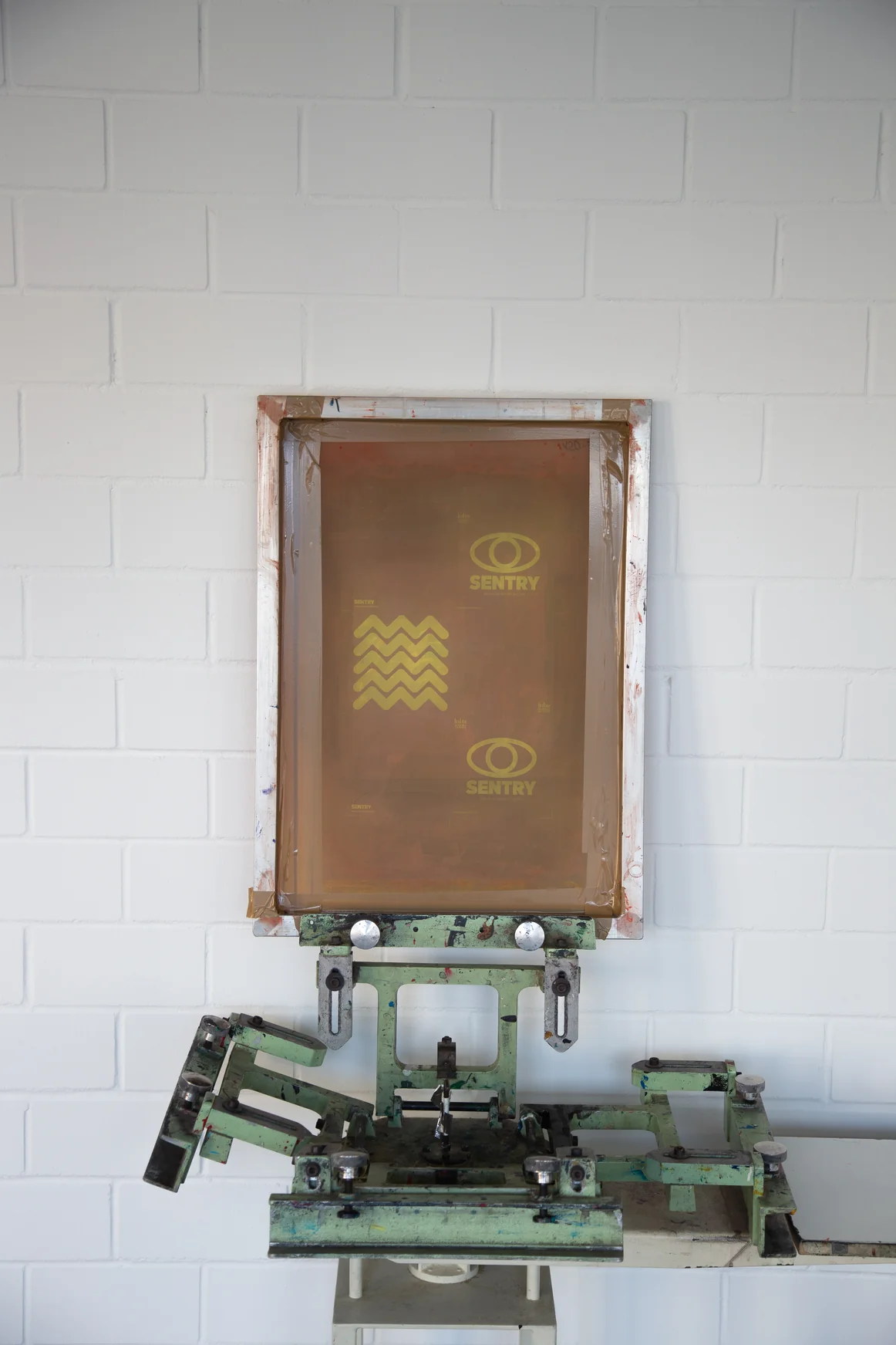
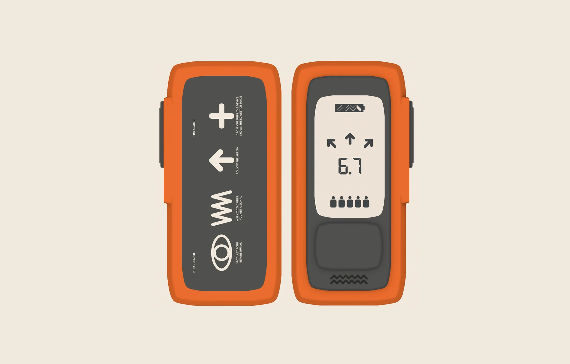
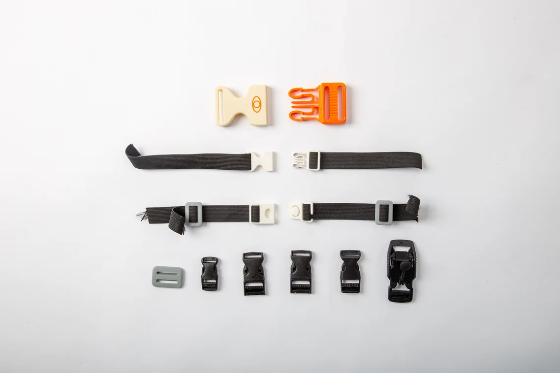
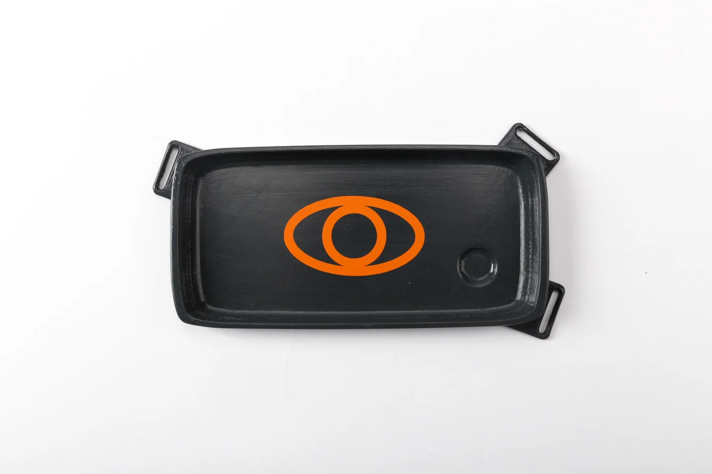
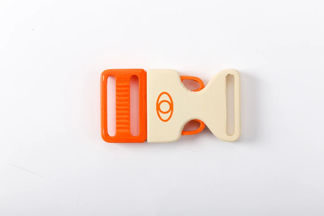
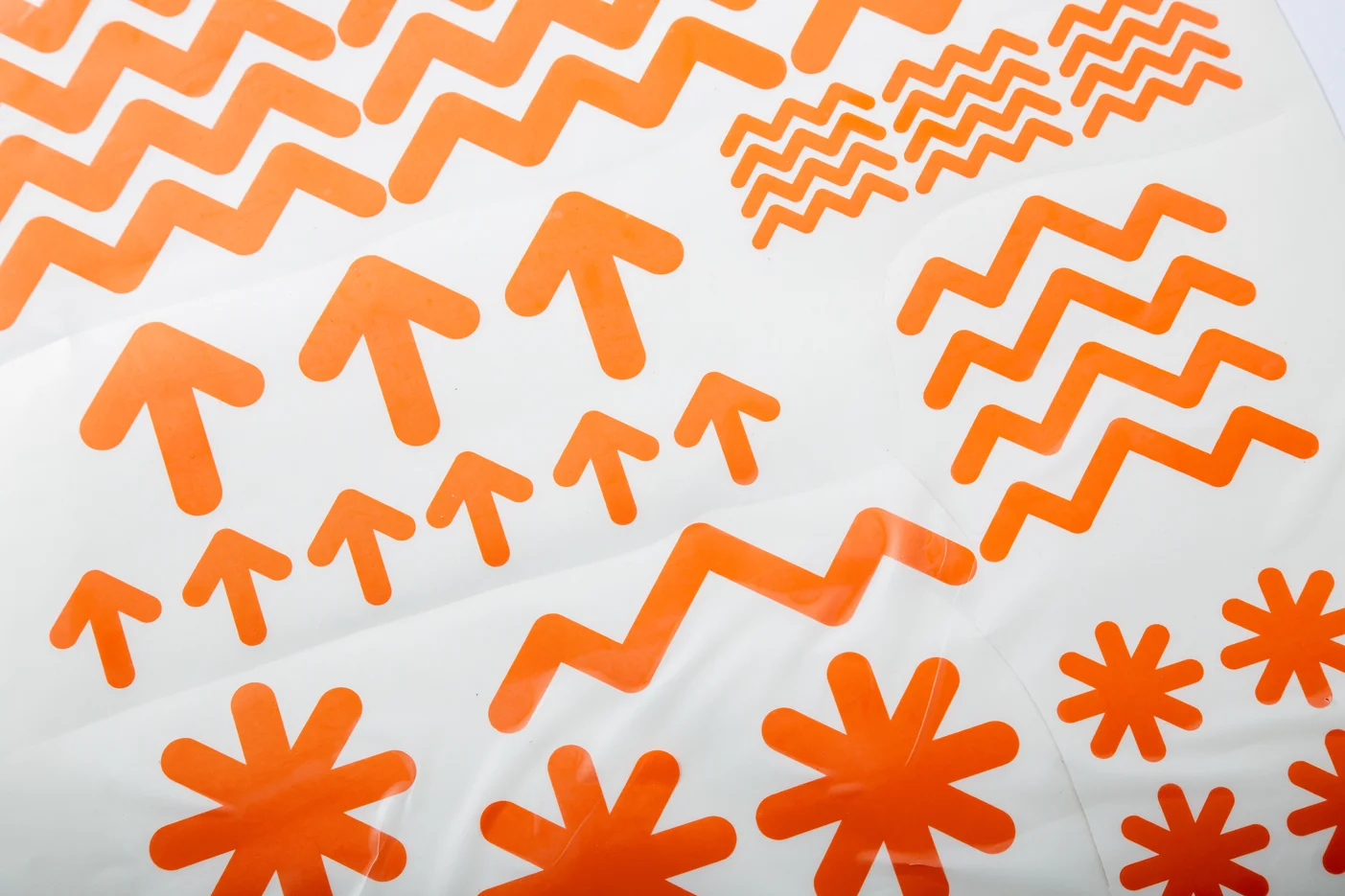
three colours do the explaining: orange is everything you touch, sand is the body you hold, anthracite is the mount that holds you. one sliding switch, search, send, off, replaces the menu, guarded by a release button so the mode can never change by accident. soft, over-tensioned volumes read as impact-resistant before you know what the object does, and the same geometry generates the icons, the display and the chevron that runs across the brand.
credits
- role
- concept, product design, brand identity, interface design
- university
- stuttgart media university (hdm), integrated product design, 5th semester
- supervision
- prof. burkhard fritz
- typeface
- gotham narrow
- colours
- orange c0 m75 y100 k0
sand c0 m6 y11 k6
anthracite k85
previous project: 500l/s · next project: hope in action · archive